

This project was created in response to a frustrating real-world scheduling experience where poor validation behavior, unclear feedback, and inconsistent usability created unnecessary friction during form completion.
The goal was to redesign the experience from both a UX and technical product perspective by creating a lightweight, accessible form focused on validation clarity, mobile responsiveness, real-time feedback, and reduced user frustration.
Rather than treating the form as a simple UI component, the project explored how thoughtful frontend implementation and interaction design can improve completion confidence and overall usability.
Many forms overwhelm users through cluttered layouts, poor hierarchy, and unclear error messaging.
To improve usability, the interface was designed using:
The goal was to reduce cognitive load while improving scannability and task completion efficiency.

Traditional forms often validate only after submission, forcing users to correct multiple issues at once.
To reduce frustration, the experience introduced live inline validation with:
This approach improved transparency, shortened correction cycles, and created a more responsive interaction experience.

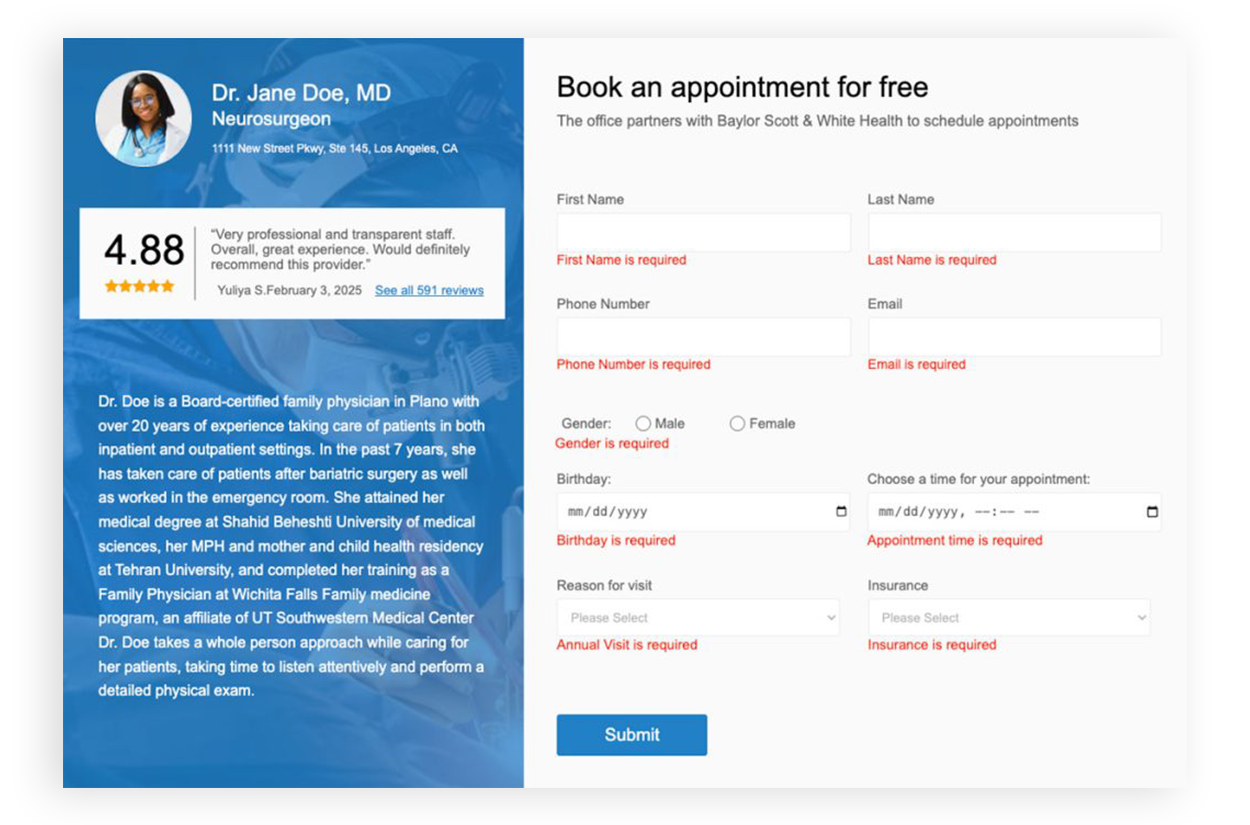
The form was designed using accessibility-first and mobile-first principles, including:
The mobile experience was treated as a primary interaction environment to support usability across devices and screen sizes.

Technical Stack
A clear success confirmation state was introduced after submission to reassure users that their information was processed successfully and reduce uncertainty after task completion.
This project demonstrates how thoughtful UX design, frontend development, accessibility, and interaction design can improve even simple form experiences.
Core focus areas included: