

This independent redesign project (not affiliated with Oh! Love Ya Dawn) explores the intersection of technical product management, UX design, and frontend development. The goal was to modernize the interface while improving user flows, accessibility, and overall experience through a research-driven approach. Focusing on key areas like navigation, storytelling, and donations, the project addresses friction points to enhance usability, engagement, and trust within a mission-driven brand that blends commerce and philanthropy.
This redesign was approached from both a **product-thinking** and **technical UX** perspective.
The process included:
Rather than focusing only on aesthetics, each redesign decision was tied to:
Problem
The original navigation included an “About” link that redirected users back to the homepage, creating redundancy and unnecessary cognitive load.
Solution
This update reduced unnecessary decision-making and aligned the experience with established usability standards, improving discoverability and navigation efficiency.
Before

After

Problem
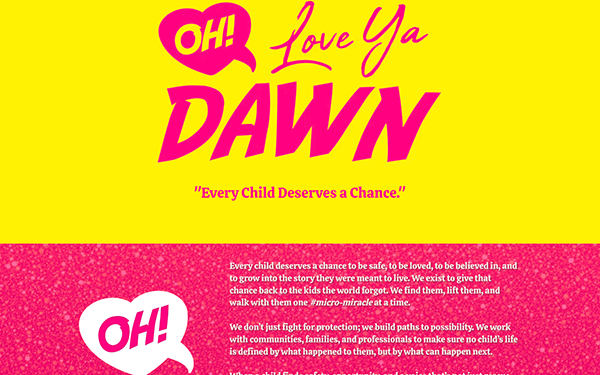
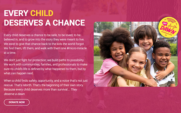
The original hero area suffered from:
Solution
The hero section was reframed to immediately communicate:
This improved first-impression clarity and strengthened mission-driven storytelling.
Before
After
Problem
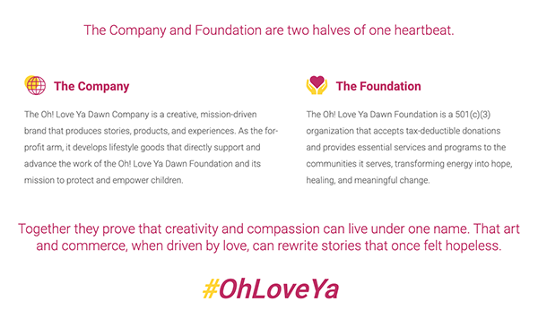
Multiple sections communicated overlapping information, causing redundancy and weakening the narrative structure.
Solution
This change improved user understanding of the organization’s business and philanthropic model while creating a more scalable content structure.
Before

After
Problem
The original form:
Solution
The redesign focused on reducing user friction while supporting multiple communication preferences and improving inclusivity.
Before

After

Problem
The original donation experience required multiple “Next” steps, creating unnecessary friction and increasing abandonment risk.
Solution
This redesign prioritized conversion optimization by reducing friction, simplifying task completion, and increasing transparency within the donation process.
Before

After

Problem
The original footer lacked critical engagement and trust-building elements.
Solution
Trust indicators and consistent branding improve perceived legitimacy and create clearer engagement pathways for users.
Before

After

I chose not to redesign the Edie’s Dawn page due to a lack of clear purpose. The page mixed product promotion, brand storytelling, and philanthropy, creating unclear user intent and stakeholder alignment.
Rather than redesigning prematurely, the better approach is to first define direction through stakeholder discovery, user research, and clear KPIs—reinforcing that not every problem should be solved without validated insight.
This project demonstrates a hybrid approach combining:
Rather than approaching the redesign purely from a visual perspective, the work focused on how product decisions, frontend implementation, and user experience intersect to create more effective digital experiences.
The project reinforced the importance of: